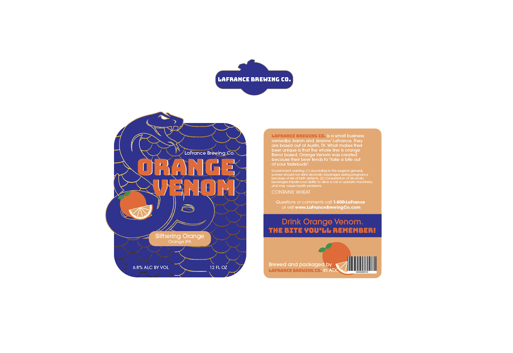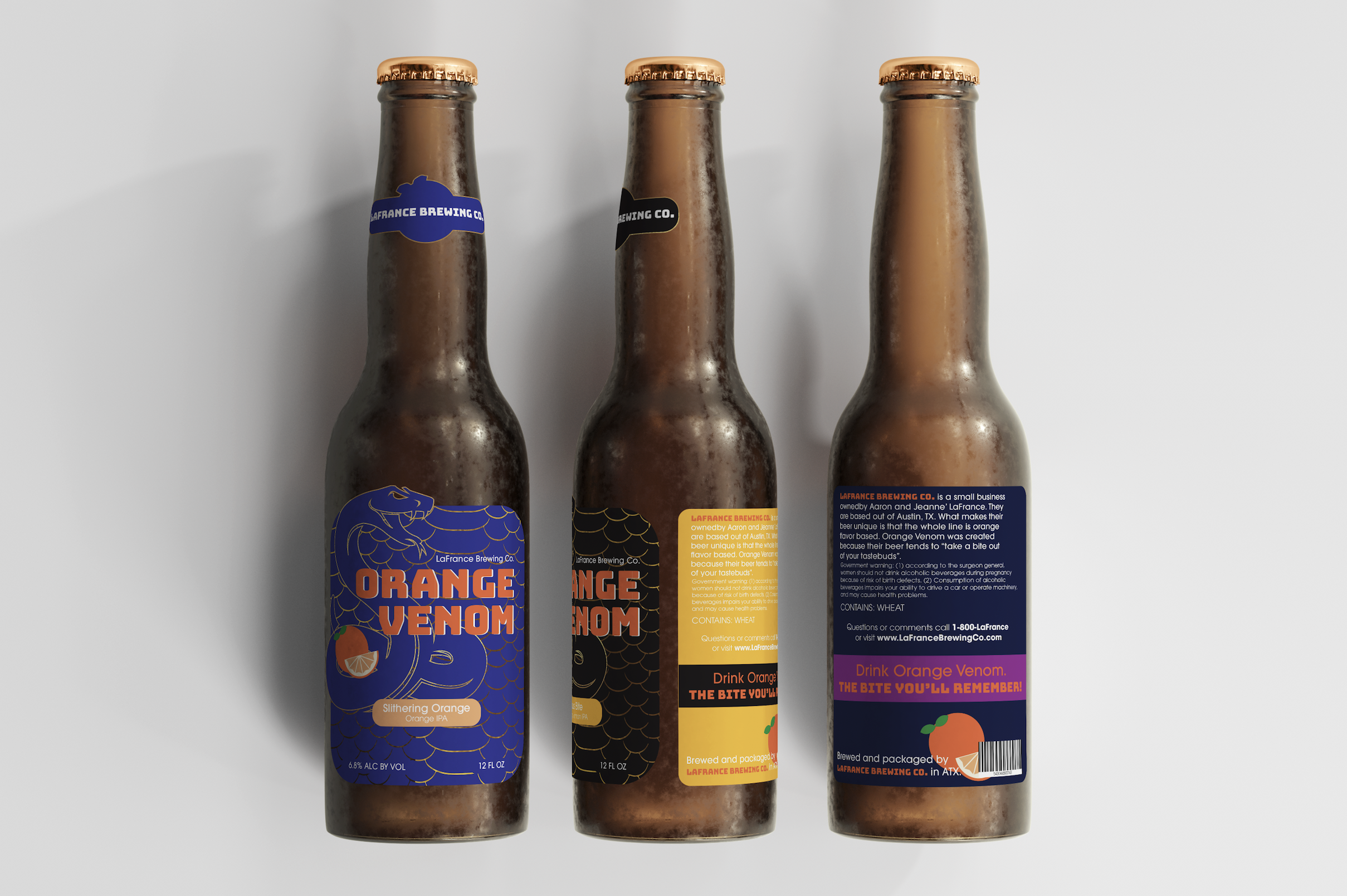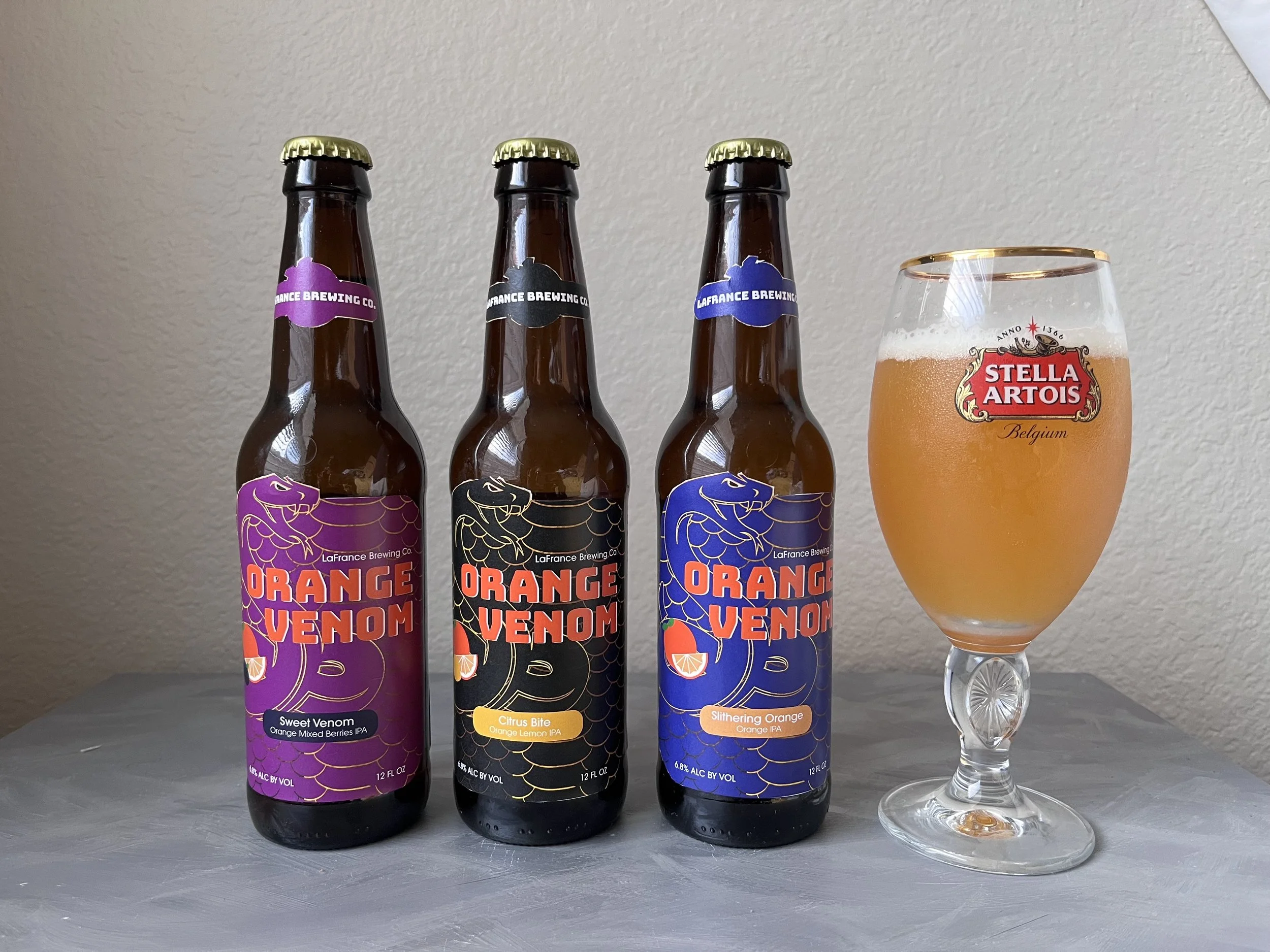
Orange Venom Packaging Design
This up and coming brewery gave my team and I the task of creating a unique logo and packaging that is as special as their enchanting line of orange flavored libations. The snake logo is a visual metaphor for the bursting citrus fruit flavor, whose bitter but sweet zest tends to “take a bite out of your taste buds.” I chose to design the label to mimic a snake’s natural ability to camouflage within its background in order to emphasize the robust flavor of the drink that will “sneak up on you” just as a snake does in its natural habitat. The color palette and font choices were based off of my mood board research. I selected dark and vibrant colors that would pop and compliment the gold foil embossing.